Hello people.
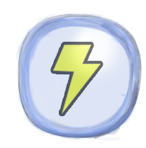
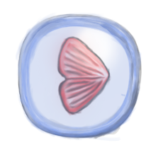
This week I’ve taken a minor step back from the design part. I am still lead design but I’ve been focusing on the graphical parts. I’ve been taking care of environment and power up icons, Speed, energy and light power ups. Each power up increases the speed, energy or light. The Game is going to contain three of each type, making it possible to upgrade the character speed, light and energy three times. It exist one of each type in every stage trough the game. Making of the icons was quite simple. The task was about to create something that fits into the universe that the game is made into.
I made the icons as a bubble holding the upgrade. The idea is that the bubble is going to pop the moment it’s colliding with the avatar. I am founding it to be a problem with the icons, to form it as something that belongs in the world.
The icon I am most dissatisfied with is the speed icon, it’s made to resemble an arrow that increase speed as well as I tried to make it resemble a simple fish fin. I think it’s a lot more detailed than the other two, I have slight concern that it either is going to stand out to much from the rest of the art work or that it’ll convey a different feeling from the rest of the upgradable.
I am concern if the bubble’s is holding the standard that the rest of the art is keeping, that it feels out of the picture. I hope that they hold enough standard to convey the message of what they do and that they need to be collided with to be activated.
I feel that I am finally starting to get to terms with the making of the game and the routine of being in the production.
The oncoming week I’m going to focus a lot more on graphical production and keeping the design in mind. Hope fully we’ll pass the Alpha that goes off tomorrow. The team has been doing a lot crunching the last couple of days. Today the whole team sat together and really worked on getting parts of the game up and running. Last thing before I left was that the fish can now eat and die of starvation.
That would be everything from me.
Adam
Over and out.


Hi Adam!
I think you’ve done a fine job conveying the feel of your game through your power-ups, I think it really blends well with what I’ve seen of your game, it matches the theme well and after watching them more closely I think it’s obvious what each respective power-up’s effects are, speed is fairly obvious and I think that the light bulb says light loud and clear. But the lightning bolt however took a bit more thinking to understand, but after I little thought I realized that there is no obvious way to illustrate energy and a lightning bolt is probably the best way to do so, but for some reason I kept thinking that the lightning bolt illustrated electricity. A couple of days ago I had the opportunity to see some of your work in progress and one of the things I was concerned with at first was that your power-up’s blend in with the environment a little too well, but when I saw your work against a darker background it really came together nicely. I look very much forward to trying out your completed game. I think it is going to be a very interesting game. Keep up the good work!
I don’t think that it’ll be a problem if the bubbles pop out from the background. You want the player to notice them anyway. 🙂
As for the bubbles, I think they look a little bit sketchy compared to all other game assets.
Talk to Mikaela about guidelines if you find it hard (since she’s the lead artist), and look at how she draws her animations.
You can see that the fish has a very clear outline, and very flat colors.
If you look at your bubble, you can see that the outline almost has no definition at all.
As a tips I’ll recommend you to use the marquee tool in Photoshop and make a circle, that way you’ll know for sure it’s round and you’ll never draw outside the marquee.
You can also use the marquee tool and then use the bucket to fill the selection, and then make a new layer and press alt + ctrl + g to create a layer mask. (check the link. When the layer gets the little arrow pointing down to the one below, it has become a layer mask)
Here’s a video: http://youtu.be/ezl_ND0z574
Also, it would have been nice to hear more about how you did the icons and what methods you used when creating them.
Nice to read about your work!
Looking forward to your next post.